Vintage Road Safety Posters
new book showcases mid 20th century communications design....

4th May, 2010
There’s something beautifully nostalgic, and indeed inspiring, about perusing vintage public communications posters, probably due to the unfortunate realisation that it’s a relatively lost art… when was the last time you saw a public information poster as simple, effective and stylish as these retro classics? Collector, Paul Rennie is an expert, collector and dealer in posters from the post-war golden age of British design, and his new book for Black Dog Publishing, Modern British Posters: Art, Design & Communication, is a brilliant homage to these lost classics…. we’re particularly taken by these fabulous vintage RoSPA posters………
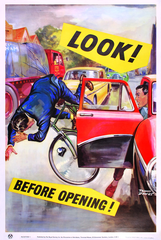
Look! Before Opening!, Roland Davies, 1950s, DC (30 x 20″)
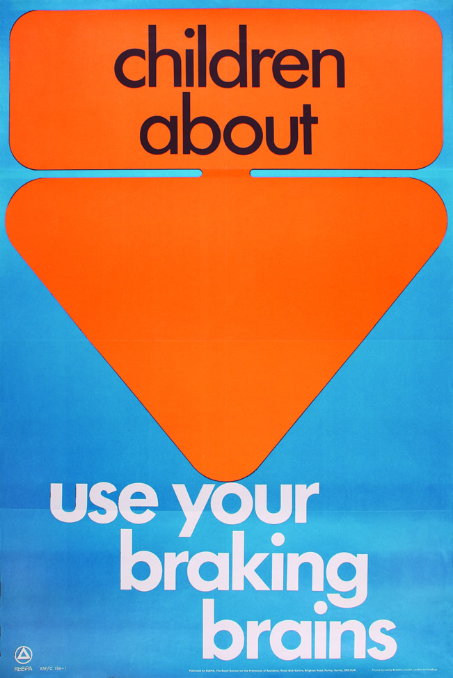
children about, Anon., 1970s, DC (30 x 20″)

wait for the traffic stop, Anon., 1960s, DC (30 x 20″)
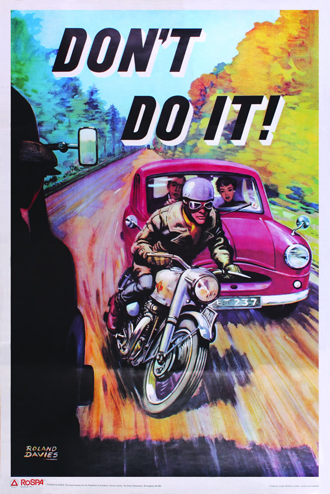
Don’t Do It!, Roland Davies, 1950s, DC (30 x 20″)

Make Sure They’re Safe, Anon., 1950s, DC (30 x 20″)
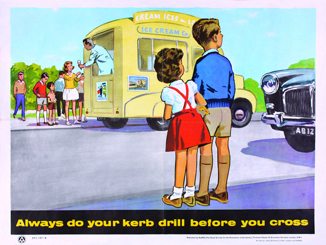
Always do your kerb drill before you cross, Anon., 1960s, C (15 x 20″)

be alive to others, Anon., 1960s, DC (30 x 20″)
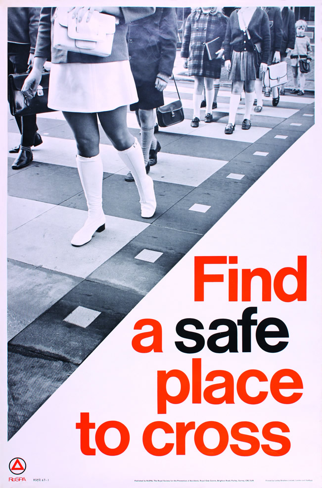
Find a safe place to cross, Anon., 1960s, DC (30 x 20″)
Modern British Posters: Art, Design & Communication, Paul Rennie, Black Dog Publishing, £29.95


Sheri Pear
May 4th, 2010
I am a merchandiser for a company that manufactures and distributes safety signs and posters. In a modern world of fast-paced public service announcements, it’s interesting to look back at safety messaging of the past. All still relevant and impactful.
Trista Yard
August 16th, 2010
Love the use of color in the “Find a Safe Place to Cross” poster. On a side note, I also dig the girl’s go go boots.
Amos Alistair
May 17th, 2011
Safty Signs are very important for safety of people on raods. If we use safty signs properly then a lot on accidents can be prevented.
Richard Porter
October 6th, 2011
Excellent. However, can someone explain to me why we don’t see adverts like this today?