Studio Spotlight: Purpose
West London studio share their secrets....

19th May, 2010
We love getting an insight into the minds of designers and studios – and thanks to Paul Felton, designer at West London studio Purpose, we’ve got one of our most in-depth studio spotlight’s to date… along with some sneakily elusive shots of their studio and a worrying musical confession or two….
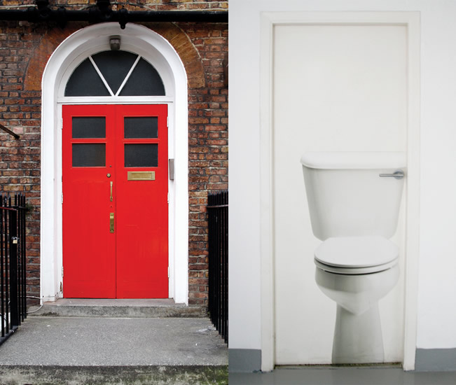
Purpose’s West London Studio
Who are you and where are you?
My name’s Paul Felton, I’m a designer at Purpose and we’re based in West London.
What mediums do you work in?
We do like to work across a range of mediums but predominantly, we specialise in brand identity and print based design.
What influence does your location and surroundings have on your work?
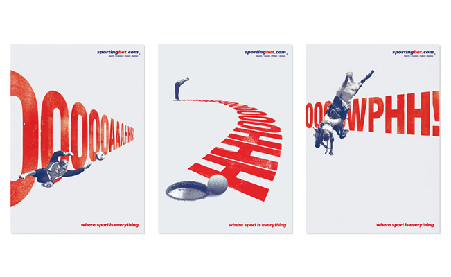
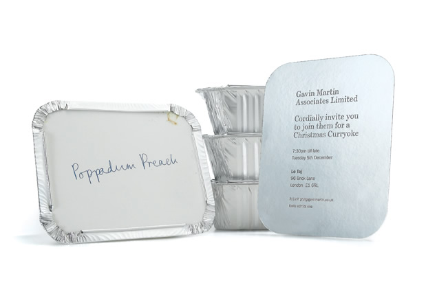
Your surroundings should always be a source of inspiration, both outside and inside your studio. I find it very important to have an inspiring working environment, just having nice things around the place, nice prints on the wall, it all helps aid creativity. It’s always a bonus if you’re lucky to have a few design hoarders and collectors in the studio so there’s always nice bits of design that everyone can gather round and ‘ooohh’ at!.
Where do you feel most inspired?
I’m not sure there is one place in particular really, but I find London as a whole a very inspiring place to be, from the expected places like the V&A and Design Museum, through to those unexpected treats you stumble across just by getting lost down a side street or strolling around a market. There’s always something new and exciting to discover and it’s hard not to be inspired by the place. I make it my duty to go to as many design talks as I can, I find it fascinating listening to the figures I admire in the industry and hearing them talk passionately about their work.
Is it important for your studio to be a place clients can feel comfortable in / impressed by?
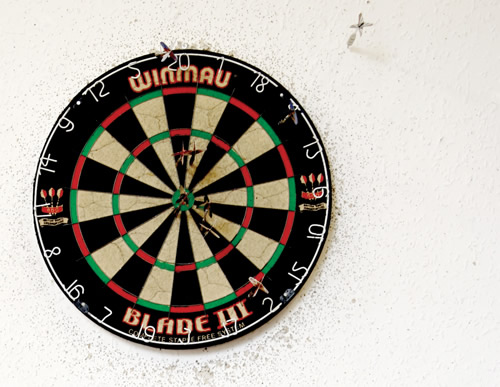
The way your studio looks to a client should really be a reflection on yourselves. We find clients really enjoy coming in and seeing what’s going on, it’s an environment devoid of suits and boring beige PC monitors, its more jeans, converse, slick silver macs and a dart board! We work in a very visual way in the studio, the walls are constantly full of ever changing work – so one week to the next the place looks completely different. We hope it’s an opportunity for them to shrug off the stuffy corporate world and we always try to get clients in and actively involve them in the creative process as much as we can.
What are you working on right now?
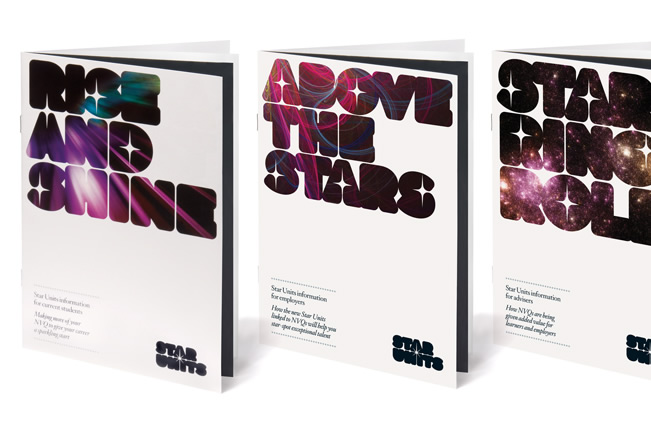
I am working on a nice little identity and catalogue for a quirky Antiquarian Bookseller, a corporate brochure and campaign concepts for one of our long running clients EFFP. Amongst other things going on in the studio, one of our most recent projects is re-branding an on-line security company.
What’s the most enjoyable project you’ve worked on?
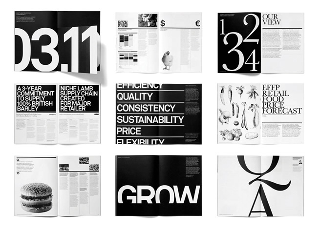
From a personal perspective, I love working on a series of magazines called ‘View’ that we’ve created for our client, EFFP. As a bit of a type-geek it’s a bit of a dream job, large format, black and white and lots of big beautiful typography. Alot of the enjoyment is possibly thanks to them being a great client who really trust us and respect our recommendations. It’s a quarterly magazine, so there’s always another one just around the corner to look forward to. It’s a pretty quick turnaround, we have around a week in total to design, amend and artwork, so within a couple of weeks of starting you have a lovely smelling piece of litho print land back on your desk!
Have you ever had a design fail?
It depends on how you judge a piece of work to be a failure and with graphic design it’s often hard to gauge. For a piece of design to fail then it must not be effective in communicating or delivering what it was briefed to do, but often that’s not always totally down to the design. With the way we work being quite collaborative and having great creative directors guiding the work it’s quite hard for us to produce work that fails in that way.
I think every designer has had work that they look back on and think ‘I wish I’d have done that differently’ or things that don’t quite go to plan at the printers, but these are mistakes more than failures which we can learn from and move on.
What’s your dream project/client?
Hmm, I can think of quite a few, however as a massive Wolves football fan, I was lucky enough to get to work on the Wolves kit last year as one of our clients was sponsoring them, so not sure I’ll be able to top that!
Everyone in the studio will have different opinions on this from stamps to record covers, massive brands to quirky little identities, but often dream jobs come in the unlikeliest of packages, as I mentioned before my most enjoyable work at Purpose has been for EFFP, now if you’d have said a couple of years ago that I’d be thrilled to be doing an identity and magazines for and agricultural business consultancy I’d have probably been rolling around laughing. So I guess it’s always worth treating every project like its that dream job and they may just turn out that way.
Talk us quickly through your approach to a new project and the processes it will go through before it’s complete….
It very much depends on the size and type of project, there’s not really a one-size-fits-all approach to our work. With bigger identity work, firstly we have a stage of discovery which is crucial for us to find out all about the client, perceptions of them, their needs and their ambitions for the future, it also then provides a platform for the creative to begin. We will then look into the personality and positioning to develop a core thought that all the concept work will spawn from. At the concept stage, a team of us will create around 3 creative routes to present to the client. After the presentation, the chosen route moves forward to a development stage with client amends and then that leads through to the final artwork and print/delivery of the finished product.
How important do you think the following are in being a good designer…. formal training / passion / experience – and what do you think makes a good designer?
They’re all very important, design is a very appealing career path so the demand for jobs is huge, I think it’s hard to get a look in nowadays without a degree. I still think there are some holes in design teaching, especially in bridging the gap between education and industry but it’s crucial in terms of teaching students that design isn’t about just making things looks pretty, its about how to communicate messages in an effective and creative way.
Experience becomes more important as you move upwards in your career, it isn’t necessarily essential to begin with, but obviously it helps! I think passion, drive and willingness to learn and push yourself is far more important. Design is one of those jobs that becomes a lifestyle, I was with a mate last week going to the Design Museum, he was on the phone to one of his mates who made a joke about us going there, he is a plumber and said ‘you’d never find me going to a central heating museum in my spare time!’. But design isn’t a 9-5 career, it’s closer to a hobby. Certainly when looking for new employees you’re obviously looking for great work in a portfolio but it’s also about how passionate that person comes across. Personally, I live graphic design and I have a constant drive to produce something nice and I think anyone with a ‘sod it, that’ll do’ type attitude will struggle.
Is it important to know about, and respect, the history of design to be a good designer?
There is as much to be learnt by looking back as there is at looking at what is going on today. I went to the Dieter Rams exhibition at the Design Museum a few months back and was truly inspired, what an amazing body of work and I was amazed at how alot of it still looks contemporary today. There was a section with some Apple products in and it’s easy to draw parallels between the two and see how Rams’ outlook on design has gone on to inspire others to create the next generation of fantastic design.
How important is it to break the rules… take chances?
Breaking the rules and pushing the boundaries is fundamental to the creative industry and it’s often where the majority of the best new pieces of design spawn from, however it’s important to have a grounding in ‘the rules’ before breaking them. Doing so with no knowledge of them in the first place will, in most cases, result in a mess! Sometimes taking chances can result in things not going quite to plan, but that’s the name of the game and often with experimentation the better way to learn and progress is by making mistakes.

Can over reliance on modern software hamper the design process?
The computer is a tool, just as a ruler and a pencil is, it wont think for you, well not yet anyway, although I’m sure Steve Jobs is working on it! A piece of work that has some amazing photoshop wizardry but no solid thinking behind it stands a good chance of being flawed. Chances are Average Joe on the street won’t even notice how phenomenal your retouching is if the design doesn’t communicate to him. Computers can make practically anything we think of possible but the starting point should always be the computer we were born with between our ears.
On the flip side a good knowledge of the latest software is imperative, as is knowledge of advancements in the digital realm and at the print house. Designers not only have to be great thinkers and communicators but sponge’s to absorb everything that’s going on around them.
Which contemporary designers/artists do you admire?
I think we’re lucky in the UK to have so many brilliant designers and studios and such a great mix of styles. People like Farrow, Made Thought and Yes who have beautifully crafted work, Frost, A2/SW/HK and Studio 8 for their awe inspiring use of type and GBH, Magpie and Music for their witty design solutions that never fail to make you smile and that’s just to name a few.
What do you get up to in your spare time? Does it influence your work?
Although it’s not always easy I do try to find a bit of time to get away from design in my spare time, I find it important to have a bit of a break and try to switch off. I play football twice a week which is a good way to focus your brain on something else for an hour or so. I really enjoy getting out and about in London, seeing some exhibitions and museums and of course going down the pub with my mates.
5 things you love….
Football (even as a Wolves fan!)
Typography
A well earned pint of ale down the pub on a Friday night
A nice piece of Pork Belly with crispy crackling
A lie-in
5 things you hate…..
Queuing
Fennel
West Brom
Washing Up
Hang overs
What current design trend would you kill off given the opportunity?
I have to say I am getting a little tired of the circle, info-graphics posters, that’s usually screenprinted white on to some black GF Smith paper, I think we’ve seen enough of them now, maybe some square ones instead?
What’s on your stereo right now?
A large majority of it is too embarrassing to say to be honest! If some White Snake or Guns and Roses is on you can bet Piers has had a hand in it, Phil’s always worryingly fighting to get Elton John on, Rosie has recently introduced a bit of hip hop to the studio, personally I like a bit of the Maccabees or Libertines and Mattley is normally bobbing his head in the corner listening to some nineties house! So we have a big mix!
What’s your favourite album cover?
Peter Saville’s New Order covers were my favourites from back in the day, especially Blue Monday and Power Corruption and Lies. More recently I love Farrow’s work for Spiritualized and also The XX’s stuff, I love the simplicity and confidence of their posters I keep seeing round the tube.
What direction do you see your work going in the future?
I have always believed that we don’t really have a style or visual direction. That is determined by what we believe to be right for our clients. I suppose our direction or ethos, if you like, hasn’t changed from the day we began and that is to produce great ideas with substance that are beautifully crafted and helps our clients communicate more effectively and I don’t see that changing in the near future.


no comments