London 2012 Olympic Mascots
we compare Wenlock and Mandeville to mascots gone by....
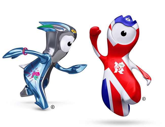
22nd May, 2010
Apparently they’re born from drops of steel from London’s 2012 Olympic stadium, and their names are inspired by Much Wenlock in Shropshire and Stoke Mandeville in Buckinghamshire, two towns with Olympic history at their heart – ‘Much Wenlock Games’ predated the modern games, whilst Stoke Mandeville is the birthplace of the Paralympics, for whom ‘Mandeville’ is the new official mascot. Along with his friend ‘Wenlock’, the pair – designed by agency Iris – have already caused much discussion in the design community since they were unveiled on Wednesday evening….. not quite as much, it has to be said, as the infamous Wolff Olins logo.
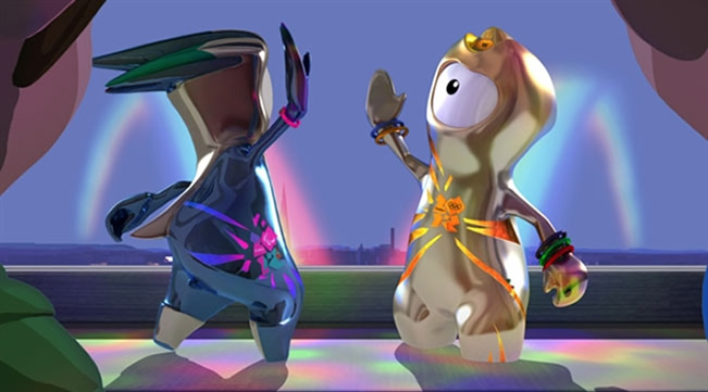
Whilst the much maligned logo has sensationally managed to win many over, it’s hard to say whether these strange metallic drips will manage to do the same – with this in mind, we decided to research the history of Olympic mascots and see how they shape up in today’s design conscious eyes……..
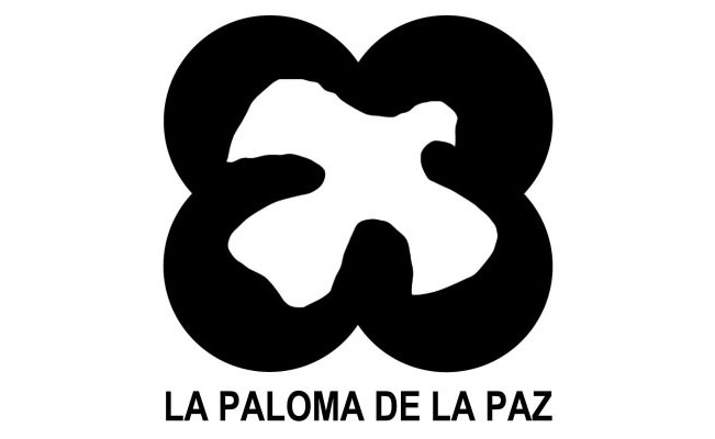
Dove of Peace – Mexico 1968
The trend for Olympic mascots began back in 1968 with this unofficial icon for the Mexico City games, a dove of peace that represented the games’ slogan – “Los juegos de la Paz” (“Games of Peace”) – ironic given ‘The Night of Tlatelolco‘, a government massacre of student and civilian protesters and bystanders, took place just ten days before the games began….

Waldi – Munich, 1972
Based on a real life Dachshund named Cherie von Birkenhof, ‘Waldi’ – designed by creator of the Rotis font family, Otl Aicher – was the friendly face of Munich’s troubled 1972 games and the first official Olympic mascot. The clean lines, and typically sophisticated German style mean that Waldi stands up rather well almost 40 years later – much like the rest of Aicher’s body of work… perhaps we should have looked to someone like Neville Brody or Peter Saville if we wanted a lasting presence…. but then maybe that’s not what a mascot should be – after all, the Germans have that stereotypical coldness that is well evidenced here!
Interesting fact: There were no black or red in the main scheme, a conscious decision by Aicher to exclude colours related to the Nazi Party
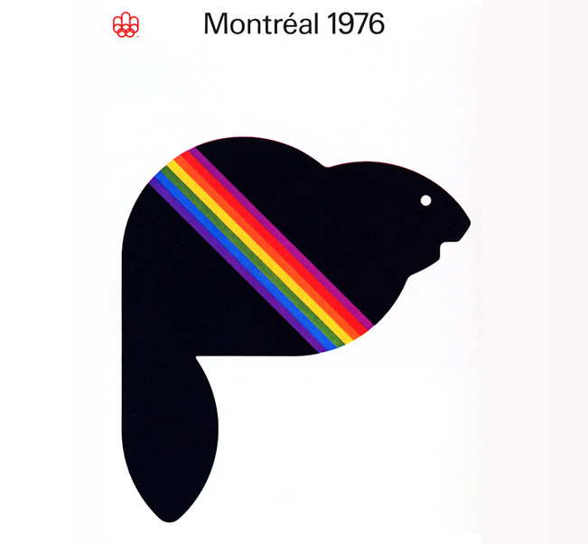
Amik – Montreal 1976
Fascinatingly minimalist, 1976’s mascot – Amik – looked more like a Spectrum ZX in this image (the standard icon featured just one, red stripe) than a warm, friendly Olympic mascot. Symbolising ‘hard work’ and being native to Canada, the beaver was chosen as Montreal’s mascot – and in many ways, its simplistic form harked back four years to Otl Aicher’s Waldi.
Interesting fact: Amik was created by the Graphics and Design Directorate, a committee made up of prominent Canadian graphic artists of the time…. Yvon Laroche, Pierre-Yves Pelletier, Guy St-Arnaud and George Huel being official credited with his creation.
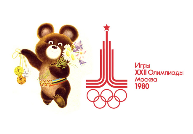
Misha – Moscow 1980
Russia’s mascot for the 1980 Moscow games was, of course, a bear… Misha, also known as Mishka, was designed by Victor Chizhikov – an illustrator of over 100 children’s books – and, having been used extensively throughout the games, was the first mascot of a sporting event to achieve large-scale commercial success as merchandise, even finding his way to a Japanese anime cartoon……
Interesting fact: Misha was the first Olympic mascot to have a girlfriend
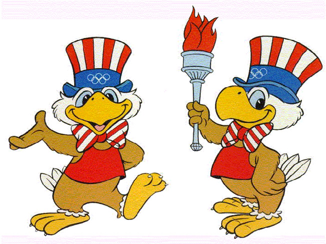
Sam the Olympic Eagle – Los Angeles 1984
‘Sam the Olympic Eagle’ appeared as a mascot for L.A’s 1984 games and was a typically American affair – strong in national identity, being a bald eagle (the national bird) and sharing a name with Uncle Sam, the famous personification of the USA. Interestingly, Sam continued Misha’s evolution from graphical icon to a mascot with identity that could be used in multiple situations… and, of course, across varying mediums of merchandise – it would seem the Americans had certainly learnt a trick or two from Moscow’s mascot, whether they had boycotted the games or not…..
Interesting fact: Sam was designed by C. Robert Moore, an artist for Disney
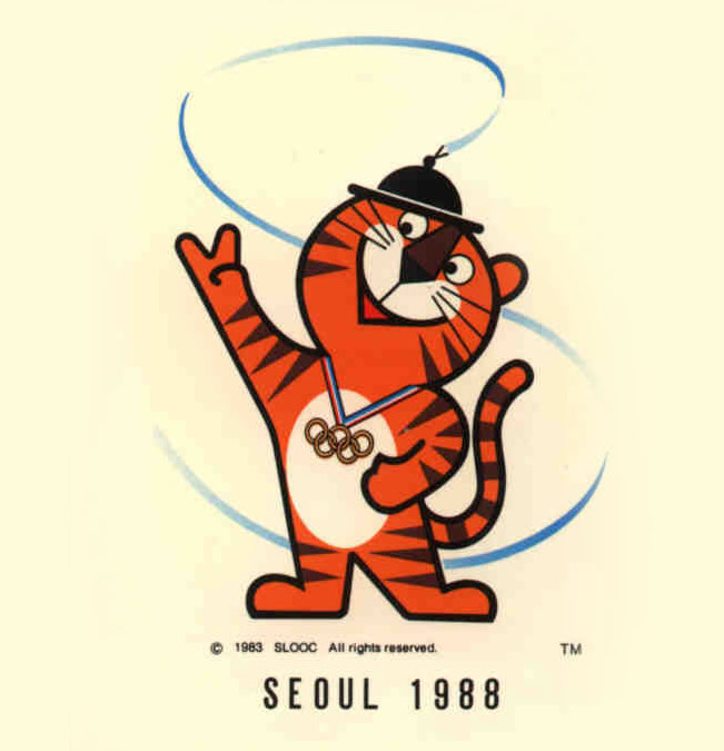

Hodori – Seoul 1988
With a standard now seemingly in place for the Olympic mascot – child friendly characters with a huge cross-medium approach to use and merchandising – designer Kim Hyun’s creation for the 1988 Seoul Olympics was ‘Hodori’, a friendly Siberian tiger who appeared in various forms around the city and can still be seen today.
Interesting fact: The name Hodori was chosen from thousands that were sent in by the Korean public
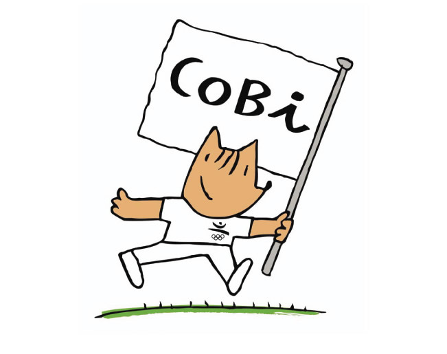
Cobi – Barcelona 1992
A cubist interpretation of a Catalan Sheepdog inspired by Picasso – it had to be Barcelona… and Cobi, designed by artist Javier Mariscal, is so very akin to the Catalan capital’s unique style. Massively successful, both in popularity and commercially, Cobi was seen in advertisements for the likes of Coca-Cola and Danone and even appeared in his own TV show.
The beauty of Cobi was his ability to act as Misha, Sam and Hodori had done – in that they were both child and commercially friendly – whilst also acting as a stylish, long lasting, icon for the games – and city – in the way that Otl Aicher’s Waldi had done. Mariscal’s Olympic mascot is, for us at least, the epitome of what a cultural mascot should be.
Interesting fact: Originally derided by the locals for bastardising Spanish icon, Picasso – Cobi, along with the game’s transformation of the city, was hailed as a hero by the end of the Olympics…. becoming a much loved symbol of the city’s progression.

Izzy – Atlanta 1996
There’s not much can be said for poor Izzy, the mascot for Atlanta’s 1996 games…. it seemed as though Cobi’s ten steps forward had been ignored in favour of an indeterminable ‘thing’, that during his lifetime underwent a number of changes – slimming to appear more ‘athletic’, growing a nose and losing the stars in his eyes amongst them. If Izzy did have one lasting impression however, it would be that – just like our own Wenlock and Mandeville – you no longer had to be, well… ‘anything at all’ to be an Olympic mascot.
Interesting fact: Izzy was the first computer generated mascot, and even had his own computer game – ‘Izzy’s Quest for the Olympic Rings’
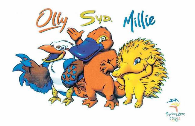
Olly, Syd and Millie – Sydney 2000
In 1997, as part of an official competition, Sydney-based graphic designer, Matthew Hatton, decided – like John Ryan, senior animation director of Atlanta-based design firm DESIGNefx, who designed the tragic ‘Izzy’ – to blatantly ignore the success of Cobi and, well, actually just ignore the last 20 years and follow Victor Chizhikov’s semi-realistic illustration style of Moscow’s Misha…. delivering the horribly uncomfortable trio of Olly, Syd and Millie – a kookaburra, platypus and echidna respectively. Sydney’s millennium games were widely hailed as the best of all time, whether these disturbing little creatures had anything to do with that is wildly unlikely.
Interesting fact: The pathetic trio were equally as popular at the time, so much so that Sydney cartoonist Paul Newell, along with TV presenters Roy and HG, created a spoof of the official mascots named ‘Fatso the Fat-Arsed Wombat’
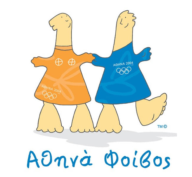
Athena and Phevos – Athens 2004
Whilst we may have been singing the praises of Cobi, and indeed deriding the subsequent attempts for not following Mariscal’s lead – we wouldn’t have quite opted for a blatant rip off in the way that Greek designer Spyros Gogos appeared to do with Athena and Phevos for Greece’s last-minute 2004 games. Causing great controversy at the time for “savagely insulting” Classical Greek culture – they were loosely based upon an archaic Greek terra cotta daidala from the 7th century BC – siblings Athena and Phevos were as much offensive for their off-putting oafishness that made them look like Cobi’s ‘simple’ relatives…..
(Borderline) Interesting fact: Athena and Phevos were described on the official Beijing 2008 website as having “whacking feet, longish necks and puny heads” – factually this is correct, however maybe someone could have a word with Chinese, introducing them to the art of the ‘euphemism’……
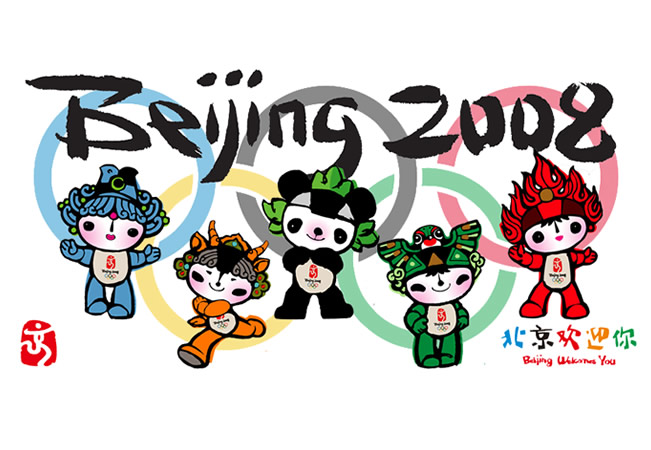
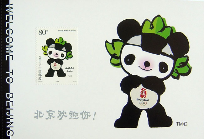
Fuwa – Beijing 2008
The latest Olympic mascots are of course those from Beijing’s recent games – the Olympics that for us will always be remembered for Herzog & de Meuron’s spectacular ‘bird’s nest’ stadium. The Fuwa (literally meaning ‘good-luck dolls’), continued on from ‘Olly, Syd and Millie’ and ‘Athena and Phevos’ before them, in that they didn’t come alone – as previous Olympic mascots had done. The group of five – Beibei, Jingjing, Huanhuan, Yingying, and Nini – each had a rhyming two-syllable name, a traditional way of expressing affection for children in China.
The first syllable of each of their names – Beibei the Fish, Jingjing the Panda, Huanhuan the Olympic Flame, Yingying the Tibetan Antelope and Nini the Swallow – even came together to form a sentence, ‘Beijing huanying ni’ which means ‘Beijing welcomes you’…. demonstrating that the Olympic mascots had become more than just a symbol of the games, but an expression of a nation, its values and how it wanted to be seen by the rest of the watching world…..
Design-wise, the Fuwa are a beautiful bunch – seemingly taking the best of all that had come before, Han Meilin created friendly, playful characters that were ideally suited for the growing needs of an Olympic mascot – particularly the commercial elements. Meilin had created iconic characters that had their own TV show, theatre performance…. and even cameoed in ‘Mario & Sonic at the Olympic Games’.
Interesting fact: Originally promised artistic license, designer Han Meilin drew some 1,000 different Fuwa, before – with some pressure from a committee (sounds like designing in the real world) – settling on the the five above. He has since disowned them completely….. perhaps Izzy’s designer should consider this too!
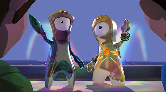
Wenlock and Mandeville – London 2012
So, what of our own shiny, little drips of metal? Upon meeting the Olympic mascots of the last 40-odd years they seem decidedly more normal… you can see the designer’s thoughts – primarily in that during the games themselves, the mascots are used across so many mediums, and more so in today’s age…. Wenlock and Mandeville – like the controversial logo before them – will be used across television, online video, social media platforms (they, of course, already have their own Twitter accounts and Facebook pages) and most vitally – the lucrative merchandise market.
Wenlock and Mandeville are hi-tech Olympic mascots, for a high-tech age… and as with Wolff Olins’ logo, it’s actually inspiring to see London pushing the boundaries of what an Olympics should look like… If we can’t match China for inspirational architecture, we can certainly match anybody for design innovation – popular or not!
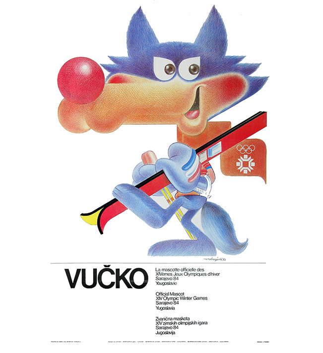
Don’t forget – Winter Olympics have their own mascots too – and coming across the cunning looking Vucko – mascot for Sarajevo’s 1984 Winter Olympics – during our research for this piece, we just couldn’t resist posting his deviant little face… just what is he thinking? Lovely design on the poster too!
Update: We have recently created blog post with list of both most popular and most commented posts on TheImport blog. And this post is among the winners! Check out other ones.


tetraptero
August 11th, 2010
Aswome post, i hope you can make Winter Olympics have their own mascots.
Greats.
Olympic Business Pages
February 24th, 2011
I think that the London 2012 mascots look a lot more professional than all of the others. As far as advertising for the London olympics goes, I think they will do a good job. Children can relate to them but they are also fairly sophisticated in their design, and the story behind them is a fitting tribute to the legacy and history of the Olympics and overall industry in Britain.
Eleanor Careless
March 10th, 2011
can i use this in my work k taa bye.
LouicCP06
June 18th, 2011
Thanks! good work
I Love Misha Bear, is so cute!!!
DesignApplause | Artists selected and mascots revisited. London 2012.
July 15th, 2011
[…] olympic mascots revisited via the import ] the jagged emblem, based on the date 2012, comes in a series of shades of pink, blue, green and […]
lulu4ever
January 2nd, 2012
Possibly the most ugly creatures ever created for Olympic mascots. I certainly won’t be buying the merchandise with these on them…. my children think they look awful too. So at least I save money this year!
Michael
January 13th, 2012
…..Izzy lives on In the American history of Sports. “Atlanta 1996”.
marshall kirsner
January 16th, 2012
I have 4 1984 winter olympic posters in mint condition. one of them is VUCKO speed skater, bobsledders if anyone is interested in buying them contact me
Anon
February 19th, 2012
The lack of inspirational architecture from the London games disgusts me.
The Chinese have more manpower, but the Brits should at least be more innovative.
rudebwoychi
March 7th, 2012
i honestly think the 2012 mascots have alot to do with the illuminati and their plan to do something evil at the olympics…and y the extra dot in the year..looks like the word zion
Miriam
March 8th, 2012
I know these images are copyright free, but could I use them for my GCSE project on the olympics. It is a private project and will not be shown publicly
shit
March 15th, 2012
its s***
shirley
March 19th, 2012
i luv dese piccies xoxox there so cool lol, i want 2 design my own one becos im cre ativ lol xxxxx
marg
March 19th, 2012
WOW im totally amazed i relii wanna deisgn one of ma own!! absouloutly amazing hehehe xxx
barbra
March 19th, 2012
these are s***
nanny pat
March 19th, 2012
these are amazing like me
sexy godess
March 19th, 2012
there sexy like me lol
jack cox
April 18th, 2012
crap
derek
April 20th, 2012
i think the old olympic mascots look really wierd and vucko’s nose looks like a d***.
hiedi
May 20th, 2012
i think they not at all sexy
Sexy Marco
June 12th, 2012
I think i am more Sexy lol
Sexy Marco
June 12th, 2012
I wanna take my clothes and show him my boobies
Sexy Marco
June 12th, 2012
The two Mascot is very weird
Drew Levy-Neal
June 12th, 2012
scary, odd and completely unimpressive.
sam
June 12th, 2012
rubish it is grat
danial hunt
June 15th, 2012
lov ur pic
pusah
July 12th, 2012
Why do they have only one eye?
Josef
July 21st, 2012
the mascots look decidedly phallic.
samantha
July 29th, 2012
I think that the most successful one was misha..Cute and warm…Greek Athena and Phivos may be awful, but English single-eyed things are way worse than them! I feel like something bad happened to them, like a nuclear explosion!
C. Sobieniak
July 29th, 2012
At least you didn’t forget Vucko! None of the other Winter Games mascots came close!
James C
August 6th, 2012
Sam the Olympic Eagle still can be seen from the I-5 at the base of the Grapevine approaching from the North. He was painted onto an oil storage tank.
Karl
August 12th, 2012
One of them looks like a penis with balls. No offence.
Kendra
August 17th, 2012
Its the Illumanti creation.. Dont let them fool you by making this new mascot. Their playing with your minds. I mean doesnt it look unusual with just one eye & a triangle (pyramid) on top of one of the mascots head?
WAKE UP PEOPLE!!!